


 INTERVIEWS
Far from everywhere: Simon Wright’s archive of Boorloo rave design
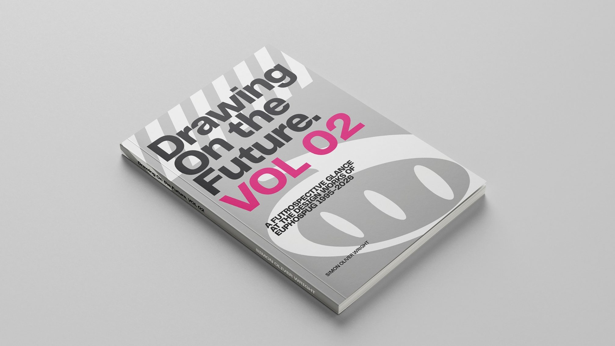
‘Drawing On The Future’ sees the writer and graphic designer compiling two volumes of Boorloo/Perth’s 90s & early 2000s visual identity.
In a world increasingly fraught with copyright issues and machine learning, no medium seems truly safe. For music, a pastime and broader culture ultimately at its core based around the sharing of human experience, even the production of music itself and its accompanying art can’t be safe from the looming threat of artificial intelligence.
A kind of future-facing optimism has stood at the centre of many artistic movements within dance and electronic music’s own image. The shelf life of such movements has shortened in recent years and become far more globalised, but distinct movements have generally always referenced themselves, like a trend cycle turning its head back towards the late 90s and early 2000s.
In that environment, Boorloo/Perth-based writer and graphic designer Simon Wright has released two compendiums of the graphic movements that still inspire broader Australia today, ‘Drawing On The Future’.
“Never give in to the temptation to use AI,” he shares, somewhat proudly.
While reminiscing in 2026 might have us looking up from our AI dramas to lament that nothing is as permanent as it used to be, 90s graphic design was never meant to be. Flyers were, ultimately, never meant to last. They were printed by the thousands, set to be left behind on record store counters or squashed underfoot on dance floors.
That may well explain why dance music culture continues to look back, not only for the kind of ‘true’ impermanence that moments had, but for the pioneering of new technologies and ideas that has, unfortunately, become as much a product of work and productivity as it has self-expression.
Wright’s compendiums tell that same kind of hopeful excitement and potential, through the lens of the world’s most remotely located major city.
Q: Simon, thanks so much for your time & congrats on the release of the two books. What was the moment that made you realise that three decades of Perth rave ephemera deserved to be in print rather than just a folder on a hard drive?
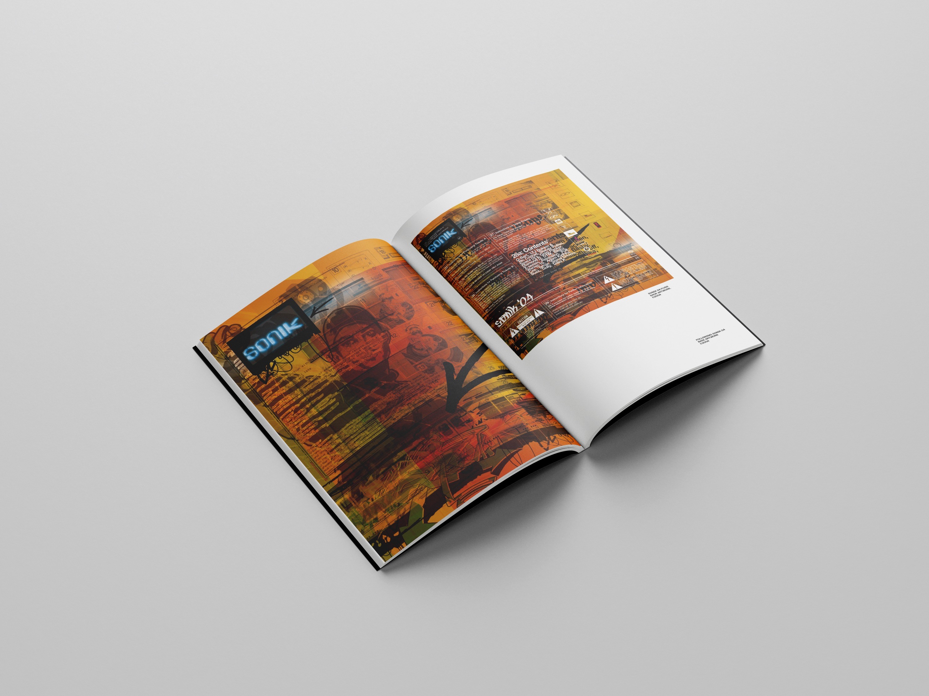
SIMON: Thank YOU so much. I’ve really enjoyed putting them together, and once I got started, it seemed like it was meant to be. I’m so glad you enjoyed looking through them. I think the realisation that 30 years had passed by, and I had seen many posts from people on social media waxing nostalgic about those times, and especially here in Perth, friends and randoms commenting on those times, so it kind of felt right to try to collect those into something tangible - I had put the flyers online on a few Facebook groups, and on my website.
I’ve always loved design books, and thought that by self-publishing through ‘print-on-demand’ I’d have a real design book of my own. The subject is quite niche and colloquial to Perth, so I wasn’t sure a ‘real’ publisher would be interested. It was also a great design project for myself - I DO like to challenge myself occasionally.
Q: How much of the books are made up of your own work, & how much have you found yourself tracking down people who used to work at the time? Has this been a cathartic experience, in that sense?
SIMON: Oh, it’s all pretty much all my own work; there were a couple of instances of events that had had a logo established, and finding the originator of those was almost impossible - except for a vague allusion to ‘maybe a designer in Melbourne’. I made sure to clearly mark those works in the books, however, as ‘by others’.
I was always happy to work with great design elements, evolve the brand, and add my own flavour to the flyers' look. I also tweaked and rebranded along the way. I still have some contact with a lot of the promoters and DJ’s from that time, so the only part of ‘tracking down’ I had to do was in order to tell the cultural context of WHY the events were initiated, what the original intent was, and how that then informed the design language.
Q: Flyers were really designed to be disposable, given they were handed out by the thousands. What's it like handling something historical that is now of value, that never used to be?
SIMON: Ahh, you see, as a punter, I’m not sure whether the flyers ever WERE disposable. Maybe at the start for the event organisers, but for those of us who loved the scene, how many had their walls plastered ceiling-to-skirting with flyers, posters, tickets, and all other ephemera? So for ME, the intent in designing the flyers was to create artworks so visually exciting that people’d have no choice but to pick them up from the record store counter. And then want to adorn their walls with them, not only because the events they were promoting were significant in and of themselves, but because they were cool artworks regardless of their original intent.
Q: Did compiling the book change how you personally remember specific nights or eras? Did the artwork jog memories the way music usually does?
SIMON: I’m of the generation, that I’m sure a lot of us are, where that era kind of had stayed with us - still listening to the same kind of music, still keeping an eye out for the same artistic touchpoints- so the memories from the book were more of the design-type things: ‘where did I get that image from’, ‘what computer crashed and I had to redo this whole thing’ type memories.
Q: Can you give us an idea of what kind of feelings these artworks were trying to capture within Perth? Is there anything specific to the city that you think this graphic design can communicate, and that sets it apart from other parts of the world?
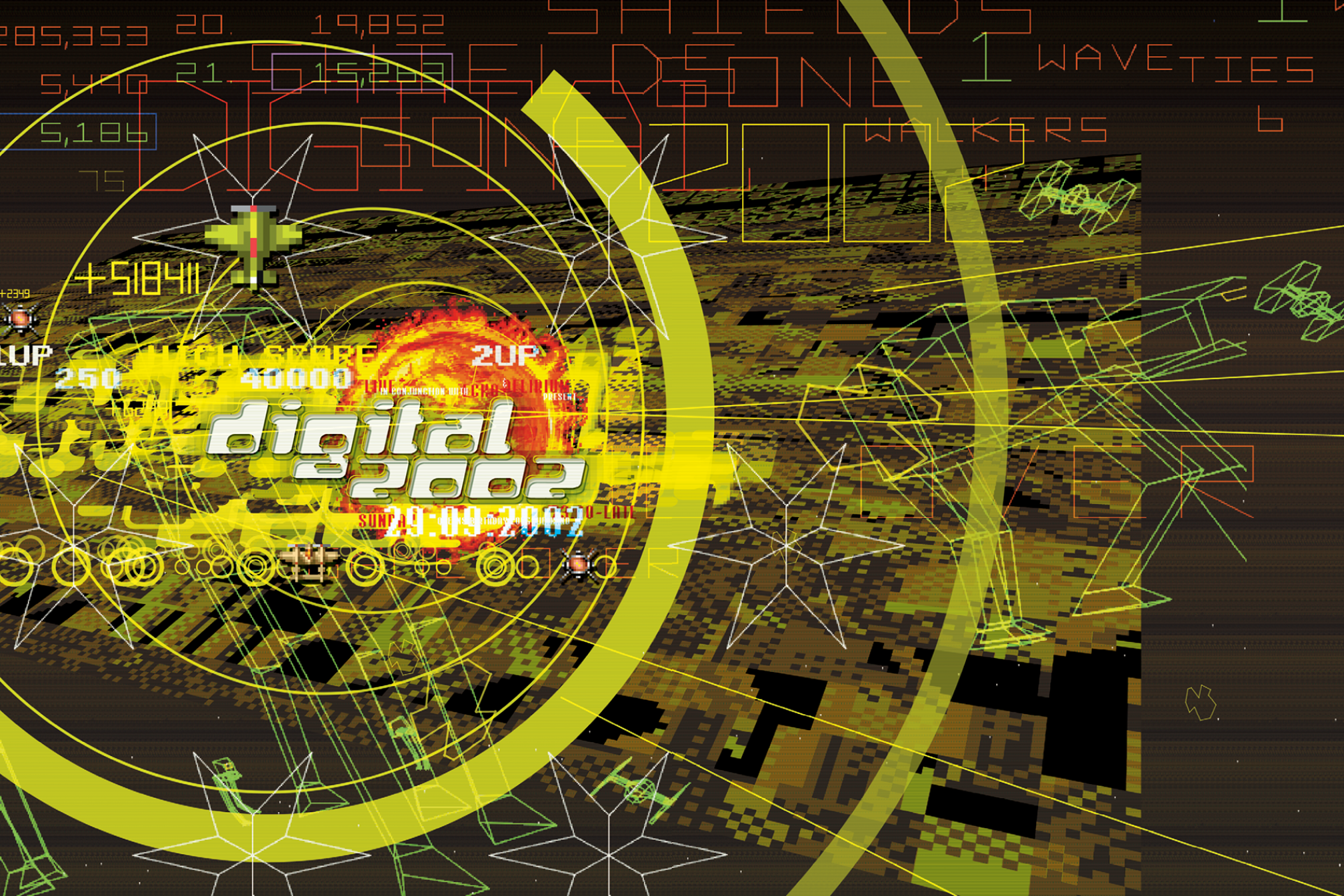
SIMON: I think this is trickier to pin down - and I can only speak to my own reasons for the look and feel. My thoughts were to react against the usual rave flyer look - the re-scanned early CGI graphics. Even some of the early Perth events were re-used UK flyer artwork - names and graphics, scanned and edited, with local details over the top.
And I wanted to create something new, from scratch, my own interpretation. A distillation of the visual language of the dance music/techno/rave scene. Mashed up with a sprinkling of the other cultural touchpoints of the time - technology, movies, fashion. A bit of everything. Putting together a visual language that reflected the music - a bit of sampling, a bit of remixing, a bit of happy-accidental randomness.
Q: How did the tools you were working with shape the aesthetic of the era in ways that would be impossible to replicate digitally today?
SIMON: I think that’s more of a mindset. It was more about the restrictions. Photography was expensive and hard to come by. There was no real ‘stock art’ to speak of. Photos were still taken on film, not digital. So, the visual assets one had to work with were ‘whatever was at hand ’-deadlines and budgets being “quick and cheap” meant bad, blurry photos, everyday objects, scanned in and edited in Photoshop. Hand-drawn illustrations and painting.
The other thing I loved to do was create textures and graphics by zooming in and enlarging things using photocopiers (at 10 cents a pop). Computers were also a lot slower, so you had time to ponder and think between saving and printing, which was also a ‘forced breather’.
Q: Rave flyer design has its own visual grammar, some common tropes of which are psychedelic type, alien and sci-fi imagery, and hand-rendered lettering. Where do you think Perth's version of that grammar came from?
SIMON: Again, I can only really speak for my own work - textures, layers, tension, deconstruction of the process, Star Wars, Doctor Who, traffic signs, video games, science fiction tropes, movement of light and space, construction signage. But I think in general there was a need, by myself, and possibly the DJs and promoters, to show that we COULD be as good (if not better) than anywhere else in the world.
Q: Was there a particular promoter, club or label whose branding you're proudest of from that period, and why?
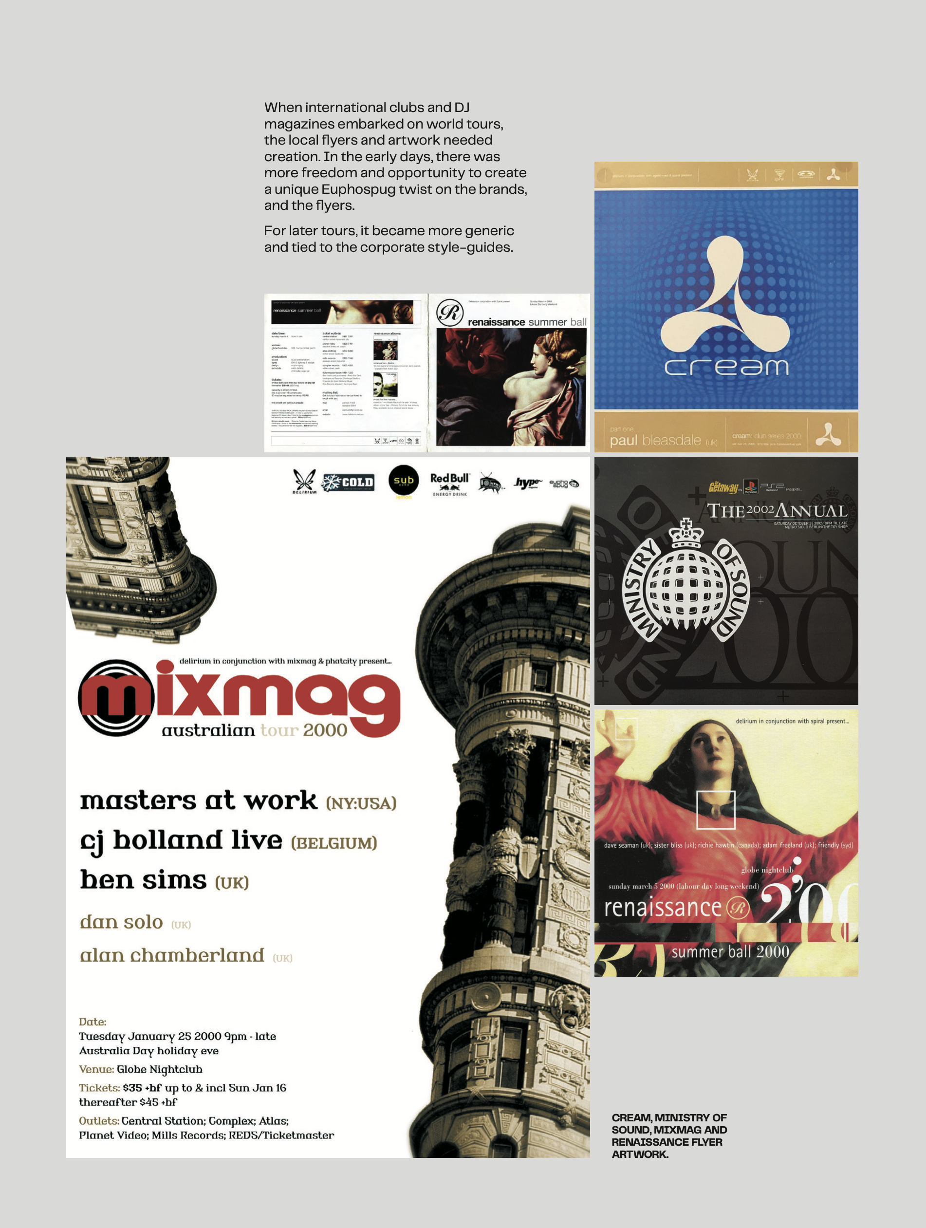
SIMON: Delirium Promotions was probably the client for which the work I am the most proud of - so many projects, so much variety, so much allowance to express my visual ideas. Jeremy Junk was a one-of-a-kind client and promoter, and he had a distinct vision for Delirium, and he put on so many great events, and helped so many others in the scene - it was such an amazing thing to be able to visually represent the vision.
Q: How did your design approach change as you moved from purely flyer work into broader branding and identity work for the scene?
SIMON: It all pretty much comes from the same philosophy - techno, for me, is about the drama, the layers, the repetition. But it’s all part of the whole. The branding has to be dynamic, future-looking, exciting, innovative, and yet recognisable and of the scene. I’ve always liked to have a little bit of cheekiness, and a bit of tongue-in-cheek humour added in as well.
Q: Walk us through the sequencing of the book. How did you decide what story the book tells as you move through it, rather than it just being a flat archive?
SIMON: Once I got started, I found that I needed to add in a bit of context. The ‘why’ along with the ‘what’. So I needed to coalesce the ‘why’ in my own mind, which led me to really analyse and understand my own design and artistic processes, influences, and techniques. After figuring this out, and giving artistic context to the visual style of the flyers, I found that it made sense to sequence the flyers in a chronological historical way, starting with the early work, and moving through time.
This also gave a clear way to explain the contrast between events and their visual style. Each contrasted with the previous. A reason for each ‘brand’ to have its own aesthetic. Never the same thing twice. Hopefully the layers of the ‘why’ also gave the ‘how’ to the ‘what’, and by sequencing chronologically we get the ‘when’ as well.
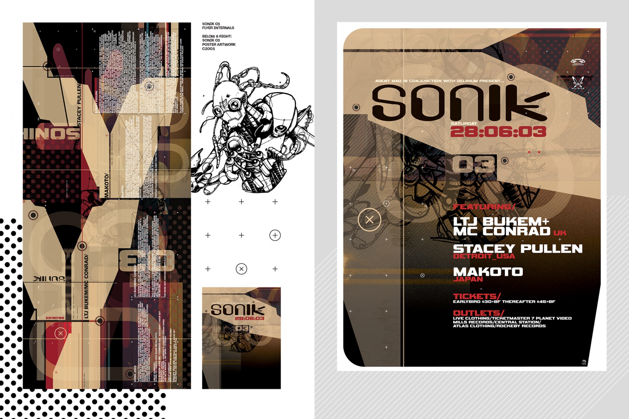
Q: What do you think this book says about Perth's dance music scene that hasn't been said before, or that outsiders tend to get wrong?
SIMON: What I love about the Perth scene in the 90s is that from the inside it felt epic, natural, a slice of time… Since that time, I’ve only heard great things from ‘outsiders’. Weird posts on forums and the like, about how amazed DJs have been to find the city when they have toured. And I've read accounts from other places at the same time, where Perth was definitely on a par, or even better. It’s hard to say what people from the outside think overall, or what they think of Perth. It would be fascinating to find out, though!
Q: As someone with all of that experience under your belt, what elements of this visual universe do you still see being explored today? Have posters & branding really evolved that much?
SIMON: I think what’s great about visual design is that at its best, it’s a combination of innovation, a reflection of the time, and a sense of experimentation. You can’t help absorbing the visual landscape of the time; mix that with an idea or two of your own, and you’ve created something never seen before. Colours and font preferences come and go, but always try something new, express the required information in a way that absorbs and reflects what you’re trying to convey, and you can’t go wrong.
Q: Dance music has an interesting obsession with 90s nostalgia, not only musically, but often visually too. Why do you think this is?
SIMON: It seems to have been a time where there was so much potential - new sounds, new technologies, new innovations- and maybe it’s because we hadn’t really finished exploring all those ideas, so there’s still excitement and novelty to be had. It’s maybe not QUITE nostalgia, but more the promised dream of that potential; ideas that didn’t quite come together at the time can now be realised.
Q: What kind of advice would you give to the newer generation of designers, perhaps placing too much emphasis on that very nostalgia?
SIMON: Similar to what I was alluding to before, don’t be afraid to try a new idea. Have a thought of YOUR OWN. Think about things in a slightly off-kilter way - you still have to ‘hit the brief’ and keep the client happy. But give them something extra, your own vision. Never be afraid to say ‘maybe…’ Nostalgia CAN be good, but in terms of dance-music production - is nostalgia a remix? Or a cover? Did you simply sample the Amen Break? or did you recreate it with a children’s toy, chop it up, time stretch it and make it your own? Make your OWN fonts. Make your OWN textures. Use stock art as little as possible, and where you do have to use it, remix it! And never, and I mean never, give in to the temptation to use AI!
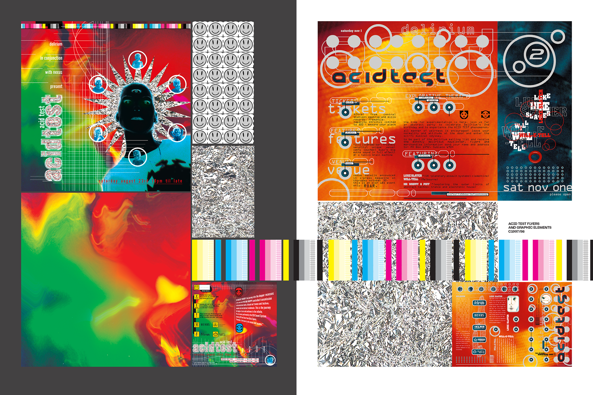
Q: Do you feel a sense of responsibility for archiving & storing memory, now that this book is all complete?
SIMON: As the default custodian of this artwork, and since it started out as more of a personal project, maybe ‘responsibility’ is too heavy a term. But now that the books are finished, I’m glad I took on that responsibility. People have been so excited to see the books, and I have had some amazing feedback and responses. I just feel grateful that I have been able to give people who loved the scene ‘back in the day’ an artefact they can hold, an object that contains a moment in time that they loved. Something they can pick up and wax nostalgic about their misspent youth, while also giving them new context for things they remember. I’m sure some people have lost their flyer collections.
I also hope people who weren’t around at the time can see a visual history of something they might not even have known existed. From a graphic design point of view, I’m proud to have collected this sliver of a niche time and place. Which, when put all together, feels like a cohesive whole - a visual story of part of the Perth underground dance scene. I feel lucky to have been part of so many people’s memories from that time. Hopefully the books will be seen as a cool look back at a time when the visual identity of the events was just as important as the music, and I hope that people from other places, other times can enjoy them for themselves - they get to see the artwork for the first time; maybe they’ll be inspired and excited as much as when the original flyers and posters ‘hit the streets’.
-
Jack Colquhoun is Mixmag ANZ's Managing Editor. Find him on Instagram.
