
 INTERVIEWS
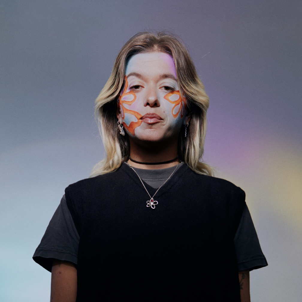
Designer Spotlight: Soft Edges
In our first designer spotlight, we sit down with Naarm-based designer Soft Edges to hear all about her process & approach to making the audio visual.
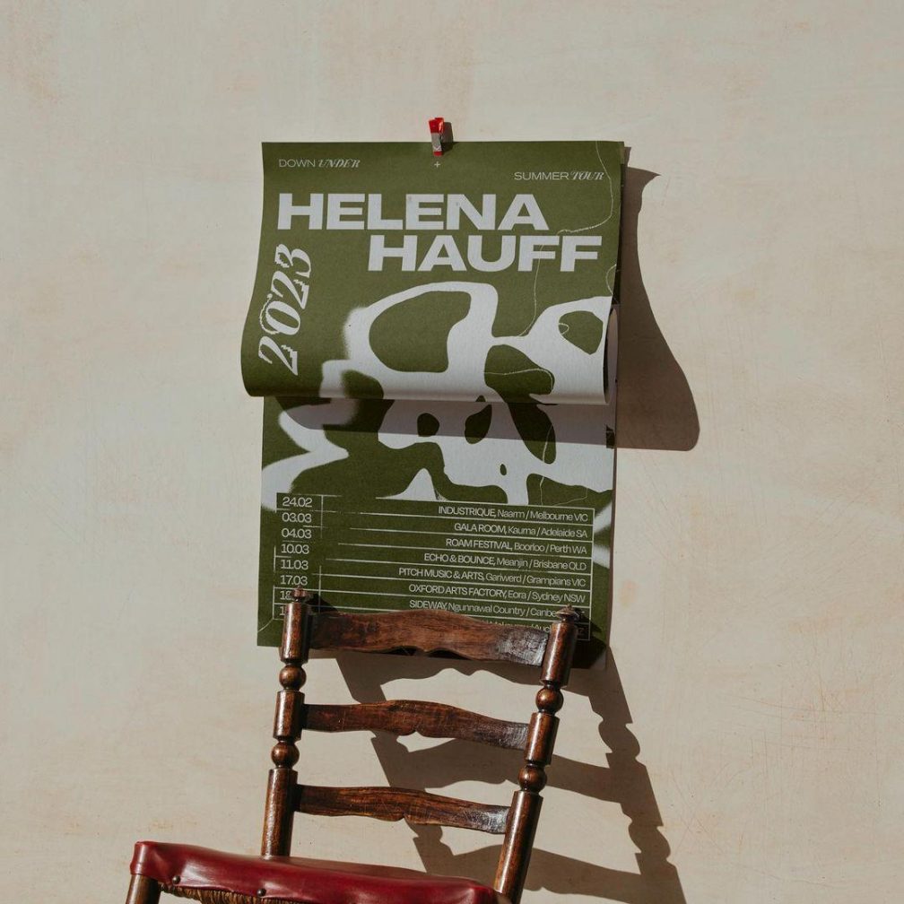
While the days of hard copy flyers, burner phones and plagiarism heavy posters may for the most part be over, posters & brand identity has never been more important to dance and electronic music.
Though a quick glance at any Facebook event listing will tell us what we need, the artists, location and general cost, the art of art has never been in a more exciting place.
It could be easy to pass most posters, album artwork and tour posts off as illegible, near unnecessary and at some times, horribly confusing. In many cases, you’d be right, but as the line between IRL & URL becomes even more blurred in our day to day, and our screen time slowly ticks up, graphic designers and artists have never had more of our attention.
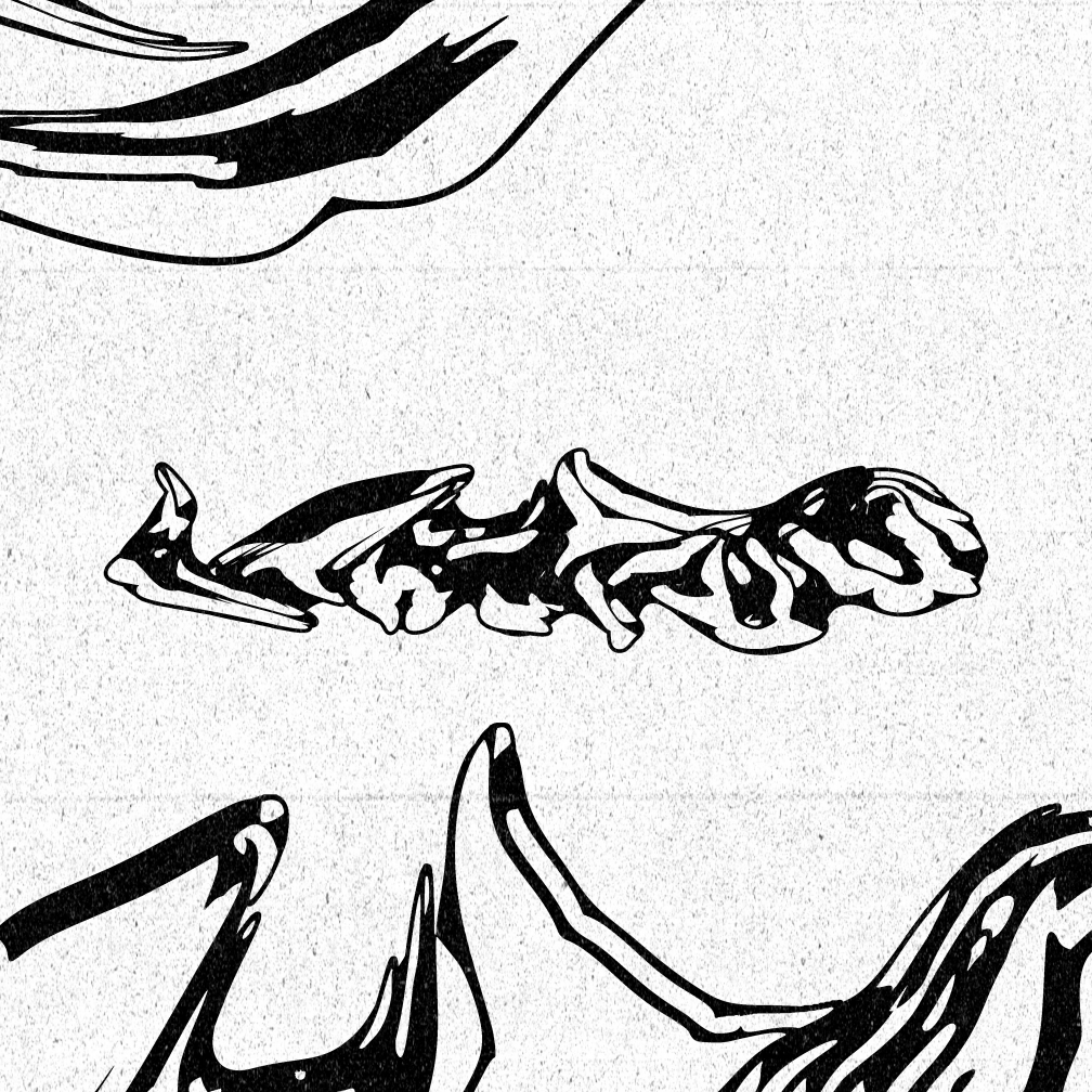
Gabriella Brown, aka Soft Edges, is a Naarm-based designer responsible for many of her scene’s most iconic pieces of art. From compilation covers to international artist’s local tour posters, Gab has cemented herself & her style as a crucial part of Melbourne’s underground.
What was the first poster you ever designed, & how did you find yourself doing it?
The first poster I ever designed was for a little event series a friend and I were running called Dancing Therapy. We were very new to DJing and fairly skint, so I decided I’d just make the posters instead of hiring someone else. I was dipping my toes into collaging at the time, so I created the poster by cutting up vintage National Geographic mags and layering images over one another—lava, space, flowers, old computer ads. The night was based around Italo disco so I’d look for visuals with a retro-futurist vibe. I enjoyed it so much I thought, maybe this is something I’d like to do.
Is design an important part of interacting with music for you? Why or why not?
I think it goes both ways for me, but more so in the reverse. Music is an important part of interacting with design. I was up late with my partner the other night, talking about a colour wheel that rolls through my head which I pair with different types of music. I guess it’s like synesthesia, but less intense. I’m sure everyone has a version of it. Music is so emotive; I don’t know how you can’t associate colours with it. For instance, bass, jungle, and dubstep are all shades of green, sometimes peppered with oranges and reds. Dub techno and tech-house are so blue, transitioning from colder to warmer tones. Micro is a funny one, but minimal is always different shades of purple for me because purple is wonky but deep. Shapes are important too. Some songs create little scenes in my head, but they’re much too complex for me to illustrate—hopefully one day.
Could you walk us through what your process is like when you’re designing for someone? How important an influence is the music of an event / release when you’re designing for it?
I start by asking for some inspirational material from the client. This can include anything from music and soundscapes to photos, old posters, textures, colours, and shapes. I try to encourage them not to send me my own work as a reference—I don’t get so hyped looking at my old stuff. I’m proud of the work; it just doesn’t get my creative juices flowing. I get more spark from a hike in the bush than from my old posters, you know?
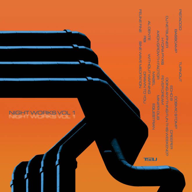
As for the music the art is based around, it definitely factors in—especially when it’s a release. My favourite kind of flow is when an artist or label sends me the demos before anything else, so I just get to listen and mind-map any imagery that pops into my head. A while ago, I created some work for a release on Hannah D’s label, TSBU. She sent me the tunes, and the words that came to mind were glittery, proggy, chimes, early 2000s, Ibiza meets silver sun, panning digital landscape, blue, silver & maybe red. You can envision the sound and the cover, I’m sure.
What are some elements or themes that you see have been really consistent within dance art in recent years in Australia specifically?
There's a big trend we can't ignore: CHROME. It's like an addiction, and I'm still hooked. Beyond chrome, we're seeing a lot of graffiti and hand-drawn elements, grungy duotone photocopy styles, wobbly/bubbly lettering, spirals & checkerboard patterns, little characters in all shapes and sizes, occasional hardcore metal lettering, and definitely abstract 3D elements. The Y2K style is also hugely popular, which aligns with the Aus prog explosion. I do think it’s shifting at the moment, though. There seems to be a lean into more delicate textural art, which I love seeing. It feels really immersive to me, I like picking apart all the intricacies.
What is it about these elements that you think “feel” like dance & electronic music?
I think we’re chasing nostalgia in flyers/cover art and in music production itself.. really everything has been done before. Don’t get me wrong, creativity is peaking, but we have so many reference points from the past that pretty much everything is chopped, screwed and recycled. These references feel like an idyllic golden era in our minds, even if we didn't live it firsthand. Then we think, “if our poster/sound/night echoes early raves we’re doing something right.” Maybe that’s too deep, I don’t know. All the elements I mentioned before hark back to old flyer styles–whether it be from early Chicago house parties, acid raves, UKG nights to early 2000’s trance events. They all feel like dance music because they are, it’s history.
Do you think it’s fair to say that design within dance music has a broader style? Or is it difficult to disentangle any consistency among genres do you think?
This is a yes and no for me. I do think dance music has a broad style overall, but there are some distinctive aesthetic differences between genres, particularly in Naarm. When you look at a flyer on your grid, you can generally tell what kind of night it’s going to be—something more techno versus something more house has a different feel, bubblier and bouncier or darker and slicker. I don’t know other cities as intimately, but it seems harder to discern the musical genre on European flyers from my perspective.
I think we divide our parties up by genre a bit more here in Naarm particularly, even compared to other cities in Australia. Like there are more little subcultures within the scene which in turn diversifies the art… but then maybe it becomes too segmented? Punters could look at the art and think “that’s not for me” instead of giving it a go.
Are there any elements you consistently revisit in your work? Why?
I think I’m fairly known for my flowers, all shapes and colours. I love flowers because of their organic beauty, but placing them in a digital space transforms their entire feel. I like the juxtaposition between something natural and something ultra-futuristic. Did you know there’s an episode of Spongebob called Everything Is Chrome In The Future? I unknowingly drew almost replicas of the metallic flowers featured in that episode a while ago, shoutout Spongebob.
I also tend to revisit any form of ripply shape; it's the way I like to hand-draw. Everything has a flow. Like music.
Do you have a favourite bit of art that you've designed? If so, what about it makes it stand out to you among your body of work?
Honestly my favourite work is the art I create for myself, just for fun. The piece that first comes to mind is called ‘Harsher Harsher’, it’s a digital artwork that is divided into three squares. The squares connect, but each is complete on its own. Visually, it’s kind of tricky to describe, there are so many layers mashed over the top of one another, colours of deep purple, silver and gold running throughout. It has an earthiness to it but it still glimmers, like a gemstone hiding or something. That piece is special to me, I actually created it during an 8 hour bus ride to Paris, although it only took an hour–sometimes lightning strikes. I had just started dating someone new at the time who inspired me to get weirder… more myself. He inspired a lot of creativity in me then, he still does.
Is it important to actually be able to read anything on a design nowadays? Posters are so rarely actually out in public, & always feature accompanying information like acts, ticket link etc. So is information on a poster a more traditional approach do you think?
This question has given me pause, to be honest, because I’m not entirely sure where I stand. When it comes to being more traditional, yes, definitely, and there's something appealing about that. So much of design is laying out information in an interesting way - typography playing a big role. However, I find myself gravitating towards art/design with less text or where it's subtly integrated. I'm kind of over the bold, all-caps headliners dominating the artwork… but I guess that sells tickets. I’d love to see more parties push against that style though and really simplify. There used to be a party at the Mercat called C-Grade–very infamous–they never had a lineup and I swear the flyer was just a smiley with a ‘C’ for its eyes then some weird quote on the Facebook event. Something about the mystery made it feel really special.
Looking ahead, what do you envision for the future of dance & electronic music design, and are there any new directions or techniques you're excited to explore in your upcoming projects?
The future feels a bit freaky; AI is already so prevalent within design, and now Adobe has even added a feature. For me, it’s a bit disheartening because I create from a very humanistic place. Even if I’m sculpting a 3D metallic blob, it just means more when it comes from your own brain. I saw a quote today that read, “I want AI to do my laundry and dishes so that I can do art and writing, not for AI to do my art and writing so that I can do my laundry and dishes”… hello!
But, to shift to a more optimistic note, I’m hoping to explore the opposite of AI doom. I want to paint, physically sculpt, and draw more. I want to learn airbrushing; it’s been a goal of mine for a while. I want to use my hands; screens are getting me a bit down.
-
View Gabriella’s work via Instagram or her website.
Jack Colquhoun is the Managing Editor for Mixmag Australia, follow him on Instagram.
